Kentucky Legal Aid Website Redesign
Making Legal Help More Accessible for Residents in Crisis
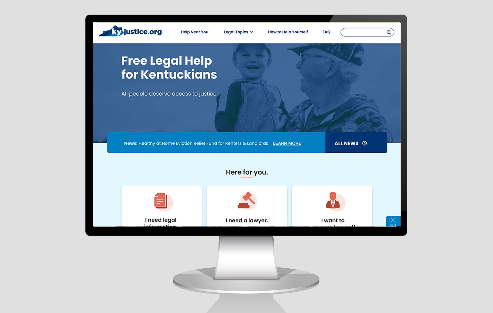
Finished product: www.kyjustice.org
(new window)
Meet Sarah
A single mother facing eviction turns to the Kentucky Legal Aid website for help—only to find a confusing, outdated, and inaccessible experience. She’s not alone. Many users struggle to determine eligibility, legal professionals are overwhelmed with repetitive questions, and mobile users find the site nearly impossible to navigate.
Key Issues Identified:
- 50%+ of hotline calls came from users confused about eligibility.
- 72% of site visitors were on mobile, yet the site wasn’t responsive.
- Many self-represented litigants lacked clear guidance, worsening the justice gap.
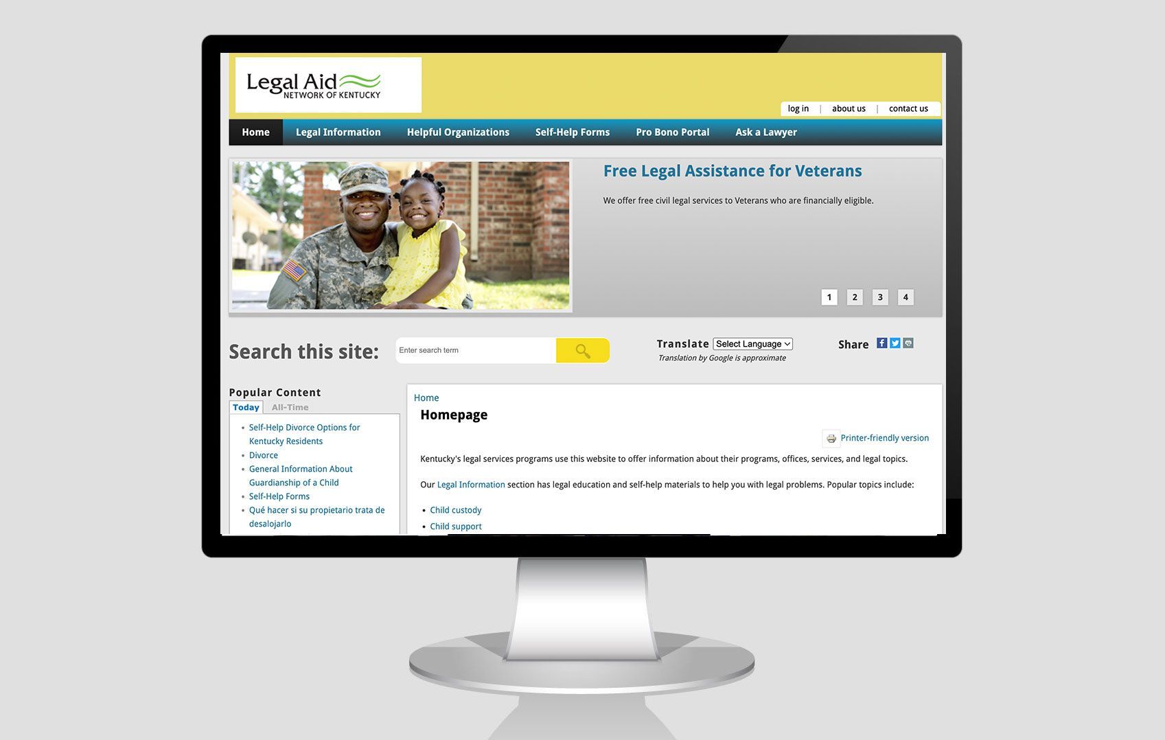
The Challenge: A Broken System
When I joined this project, the existing website was unusable for the very people it was designed to serve. Through interviews with users, attorneys, and social workers, I uncovered major pain points:
❌
Eligibility confusion
– Over 50% of calls to the legal aid hotline were from people confused about whether they qualified for free help.
❌
Overwhelmed legal aid staff – Call center workers and attorneys spent hours answering the same questions, instead of handling cases.
❌
Poor accessibility & mobile usability – The site wasn’t mobile-friendly, despite 72% of users accessing it on mobile. Many users had low digital literacy or used old, damaged devices.
❌
The justice gap – People who didn’t qualify for free aid also couldn’t afford private lawyers, leaving them without guidance.
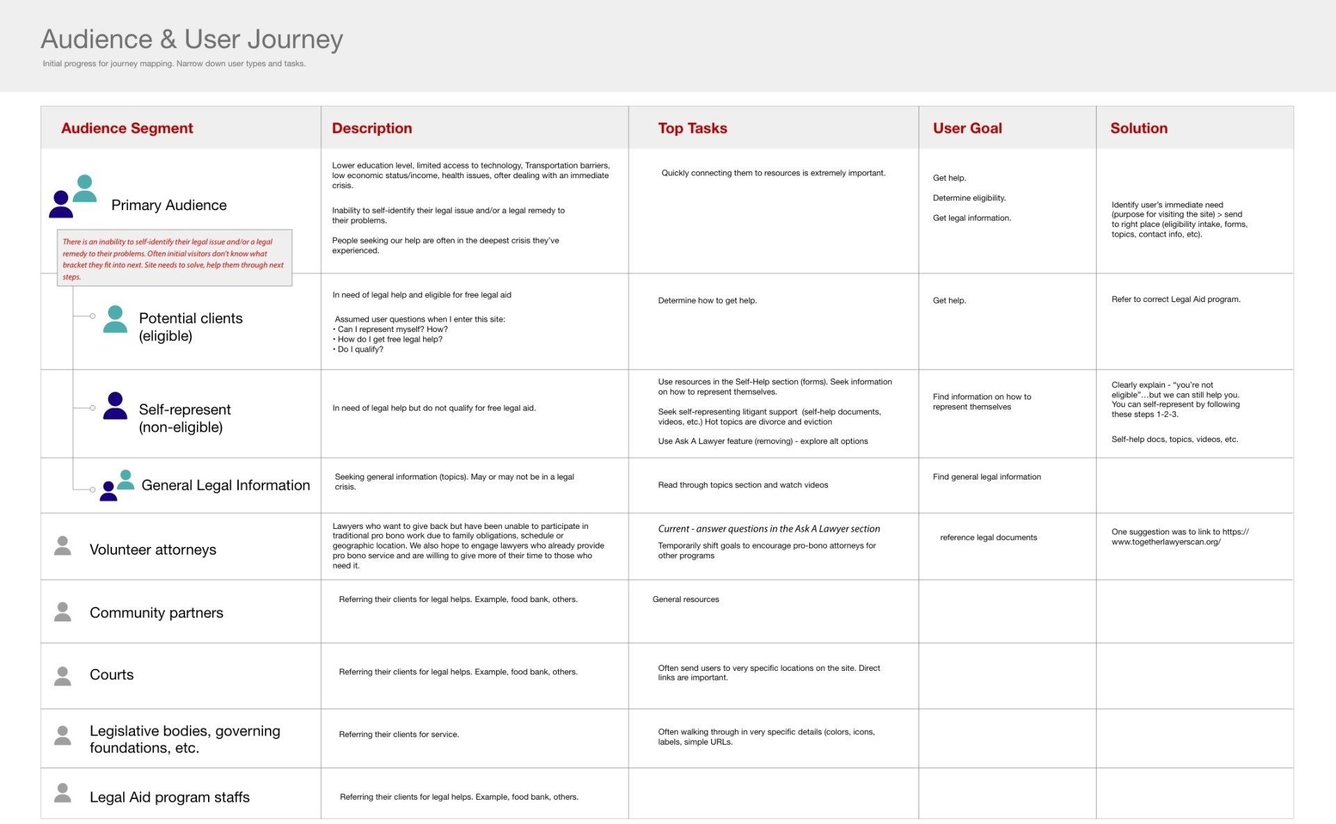
My Approach: Putting Users First
Before jumping into solutions, I needed to understand users' real needs. I led a research-driven UX strategy, including:
- User interviews with legal aid clients to understand their frustrations.
- Stakeholder workshops with attorneys, call center workers, and social workers to see where the biggest bottlenecks were.
- Site analytics review to track user drop-off points.
- Usability testing to identify barriers to completing key tasks.
🔎 Key Insight: Most users searching for legal aid were already overwhelmed, in crisis, and unfamiliar with legal terminology. They needed a clear, step-by-step path to understand their options—without complex forms or legal jargon.
Solutions & Design Decisions
Armed with user insights, I designed four key UX improvements:
Solution 1: Simplified Eligibility Check
- Before: Users manually searched for legal aid qualifications.
- After: A dynamic, step-by-step eligibility tool with plain-language guidance.
Solution 2: Mobile-First Accessibility
- Before: Site elements broke on smaller screens.
- After: A fully responsive layout with clear navigation and larger touch targets.
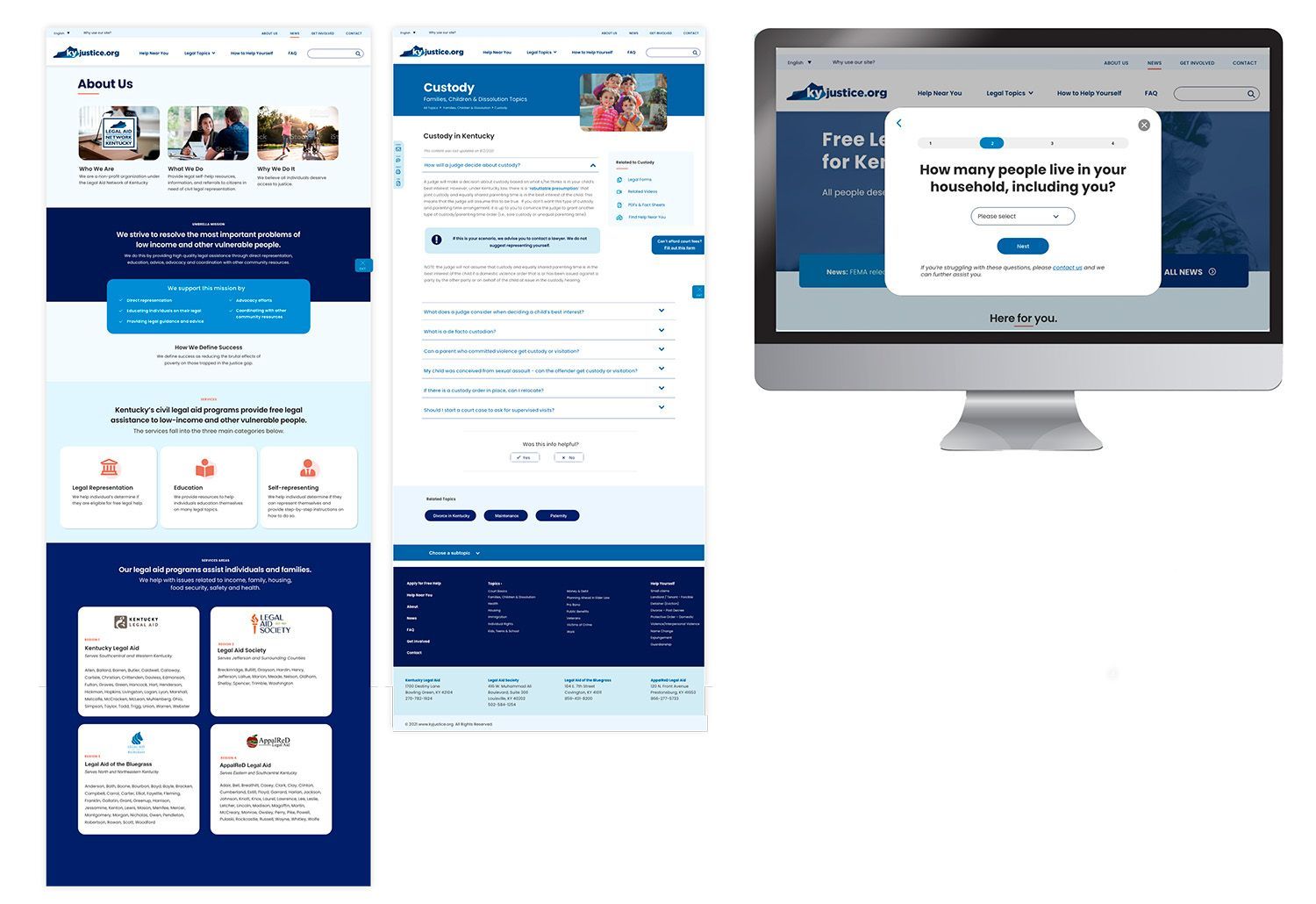
Solution 3: Guided Legal Help & Forms
- Before: Users struggled to find and understand legal forms.
- After: A conditional form system that tailored results based on user needs.
Solution 4: Clearer Navigation & Emergency Exit
- Before: No clear guidance across multiple legal aid offices.
- After: A unified site structure, interactive maps + an emergency exit button for at-risk users.
Real Impact for Real People
The Outcome:
✅ 50% reduction in call center volume – freeing up legal aid staff for urgent cases
✅ 40% faster completion time for the eligibility check
✅ Mobile engagement increased by 68%, improving access for on-the-go users
✅ Higher user confidence in navigating the site (+30%) based on surveys
IMAGE
Key Takeaways: Lessons in Impactful UX
This project reinforced the power of user-centered design in high-stakes environments. By focusing on real user needs, accessibility, and mobile-first principles, we turned an outdated website into an empowering tool for legal aid seekers.
💡 My biggest lesson?
In crisis-driven experiences, clarity and ease-of-use aren’t just nice-to-haves—they’re lifelines.
IMAGE